

The Warm-Up
The majority of personal trainers are freelancers, and a website can be the best advertising tool for fitness services. So, why are personal trainer websites so important?
People Can Find You
People might be on the lookout for UK personal trainers, but they won’t find you unless you increase your visibility. A website can expose you to a broader audience and ensures you can answer potential clients’ questions.
Turn Leads into Clients
It’s important to mention that 85% of shoppers view a website on one device and make a purchase using another. This data alone shows that customers no longer make an immediate purchase. If you don’t have a responsive website, you could lose out on a potential client.
Selz published a list of e-commerce statistics, and they’re useful for service-based businesses to know too. You can view the list here.
Educate People
Service-based businesses must be able to educate people. If you’re not an expert in your field, then nobody will trust you enough to part with their hard-earned money. Blogs are an excellent way to gain authority in your industry, and they can direct traffic to your website.
An infographic from Demand Metric shows how valuable content marketing is for a business. Through a blog alone, you can increase your indexed pages by 434%, which means a lot more traffic.
Showcase Your Results
We spoke about trust earlier, and there’s no better way to gain your potential clients’ confidence than letting previous clients do the talking for you. A website means you can showcase weight loss results and use testimonials to prove your service is worth every penny.
The Best Personal Trainer Website Examples
Now it’s time to take a look at the best personal trainer website examples and see why they work.
The Body Blueprint
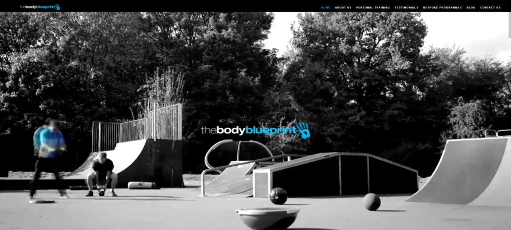
The Body Blueprint is a classic example of less is more. Their clutter-free website focuses on the need to knows of their business. Offering a mixture of one to one and online coaching, the company manages to condense everything into an attractive homepage.
Perhaps the best thing about the site is the way their blog posts are displayed at the bottom. While The Body Blueprint is for everyone, their website design has more masculine elements.
Equinox
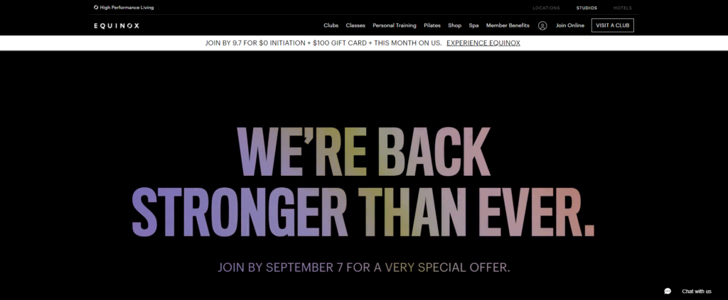
Clicking onto the Equinox immediately filled us with inspiration and motivation. Their tagline “It’s Not Fitness, It’s Life” is just one of the things that makes this website stand out. Rather than a single personal trainer, Equinox is a platform for premium fitness clubs across the US.
One of the best things about their website is its ease of use. Everything you need to know displays on the homepage and users can find their nearest fitness centre by clicking on the Visit a Club button.
Overall, the website has a simplistic design, which works well to highlight its many fitness offerings.
Mark Personal Training
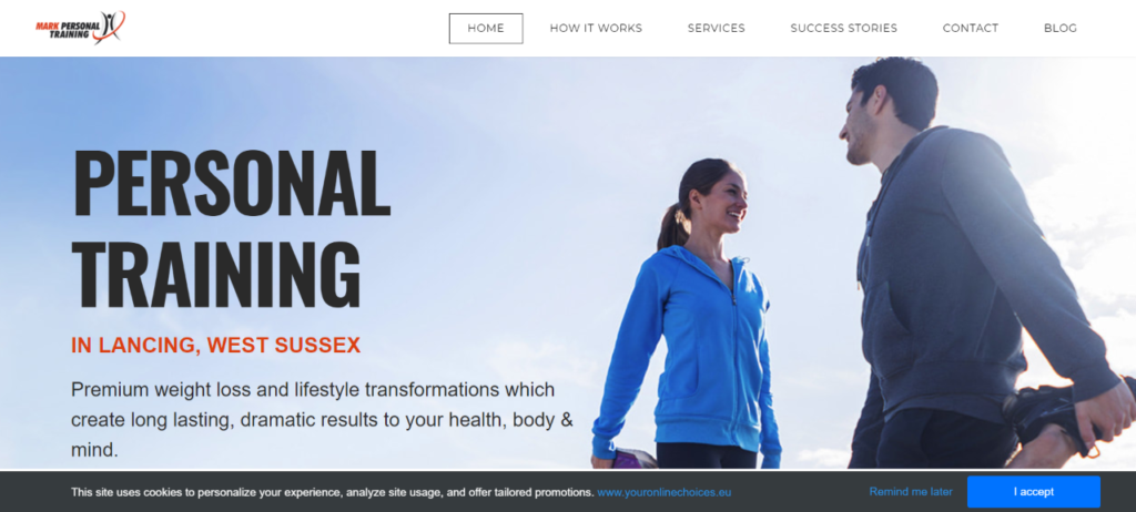
Mark Personal Training is a small business with a big website. Everything from the graphics to the typography is on point, and it immediately drew our attention. The homepage features everything you need to know about the business, including the mission statement.
The headers and subheaders contain keywords to boost the SEO ranking, and the simplistic design adds to the appeal of the site.
Freeletics
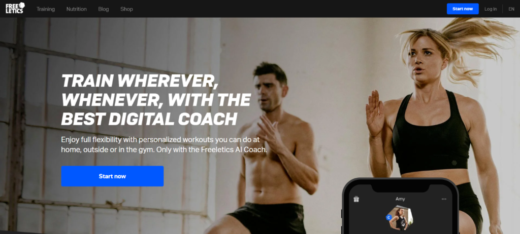
Freeletics specialise in digital coaching, and their message delivers emotional value. Viewers immediately see that they can train anywhere and everywhere, which gives the company an excellent USP. But, what about their website design?
The superb navigational features stand out, and eye-catching images make it difficult to click away. Perhaps the most inviting part of the website is the one-step registration. Instead of filling out countless forms, you can choose to register with Google or Facebook.
My Story Terfit
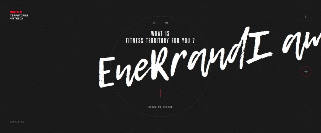
If you’re searching for creative inspiration for your fitness website, then you need to check out My Story Terfit. The company does seem to have some problems with the English version of their website, but the concept and design are the best we’ve seen.
The project centres on real people and their journey to fitness. While some are professional athletes, others are individuals that needed to get in shape and succeeded. Users can upload their photo, set their goals and take part in the game like scenario.
With an original concept and design, this website could pack a real punch – if only they would fix the responsivity issues.
Aaptiv
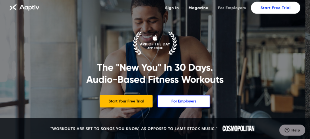
Most of the personal trainer websites we see tend to use black and white colour schemes, but not Aaptiv. The blue colour tones make the site stand out and immediately draw your attention to the training videos they offer.
With thousands of workouts to choose from and a selection of free songs with each membership plan, there’s a lot on offer. There’s so much to see, but the design means you can browse the website with ease and enjoy finding out how Aaptiv can help you.
Of all the websites we looked at (and there were a lot), Aaptivs design stood out, because it combines aesthetic appeal with practicality.
Fitnessbodystar
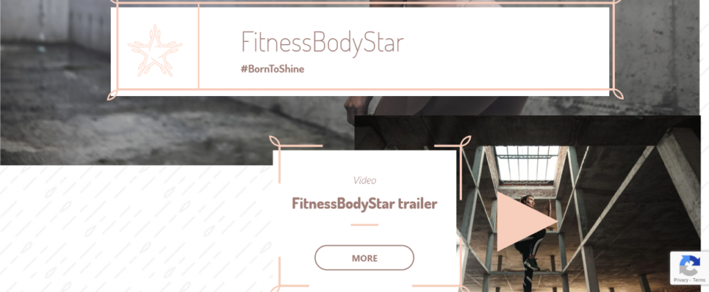
Fitnessbodystar is a personal training company for women that specialises in selling training programs and nutritional support. When we looked at Fitnessbodystar, we noticed the memo board theme of their website, which lists every feature and product the company sells. It’s a beautiful design and appeals to women immediately.
What we love most is the responsivity of the website, which looks and works great on mobile or desktop devices. The content is easy to read, and the company sticks to the facts rather than offering streams of information.
The Finisher

The websites you’ve seen show businesses of all sizes using minimalistic designs to bring their personal trainer sites to life. So, what are the most important lessons you can learn from them?
Less is More
Nobody likes a cluttered home or workspace, and it should be the same with your website. People want to access the information they want with ease, so don’t fill your pages with streams of content.
State Your Name
All of the websites we featured have some of the best personal trainer business names around. They’re catchy and sum up exactly what each offers. If you’re struggling to think of a name, you can use a generator for inspiration. We love this one from BizNameWiz.
Find the Right Designer
The best UK website designers understand that each industry is unique, and will work to deliver a compelling site that showcases your training business. Templated websites come with a premade layout, and you can ask the designer to customise it to your requirements.
Check our Personal Trainer Template
Looking to get your own personal trainer website?
Contact us today, and we’ll be happy to assist you.