10 Shocking Website Designs That Will Make You Cringe
Have you ever visited a website and immediately liked the company because the site was attractive? It’s a fact that first impressions matter and most designers dream of creating a site that other people aspire to. But what surprises me most, is the ones that seem to go out of their way to build the worst websites imaginable.
As the saying goes, negative attention is better than no attention, and these websites are worthy of their own Razzie awards. Let’s take a look at some of the most shocking website designs.
Important Note
Before we dive in, I want to say that web design is complicated, and this post is to show people what not to do. It’s not intended to offend anyone. If you’re the owner or creator of one of these websites, then hopefully you’ll pick up some useful website design tips. Ok, let’s go.
Lings Cars
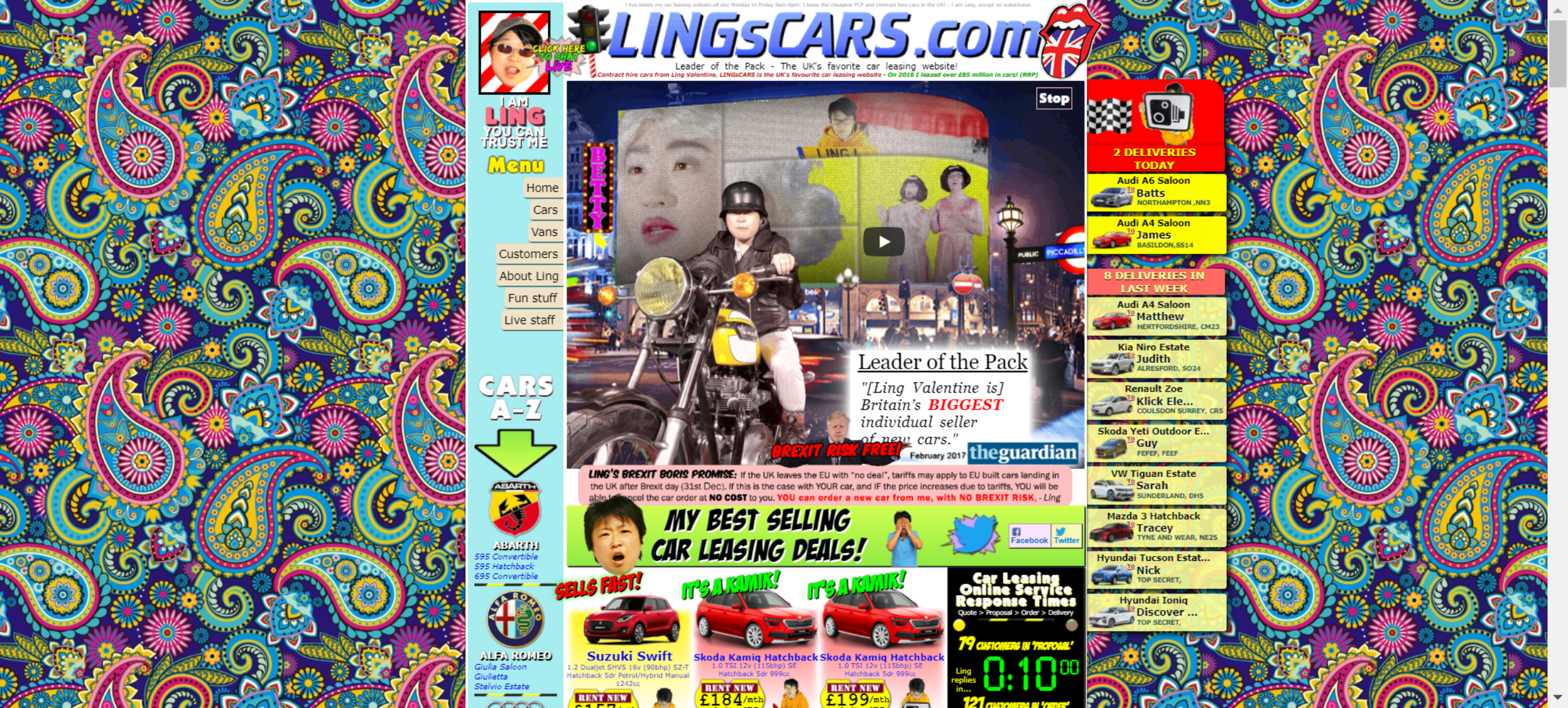
Ling’s Cars is one of the craziest websites I’ve ever seen. Funnily enough, Ling himself says on his homepage “I am Ling. You can trust me”. Unfortunately, the last thing anyone would feel is trusting when they visit this site.
The purpose of Lings Cars is to help people find cars to lease, but with the retro background and the crowded design, the last thing I want to do is look at the vehicles on offer. Ling seems to take a light-hearted approach to his work, but I can’t help wondering who designed this website and what on earth inspired them to do so.
The Takeaway: Reputation is everything, and if you don’t take yourself seriously, nobody will.
Irish Wrecks Online

Irish Wrecks Online is all about shipwrecks, and their website is no different. In contrast to Lings Cars, this designer decided to go for a simplistic approach which borders on depressive.
I can imagine this website being revolutionary 30 years ago. Still, it doesn’t make me want to learn about shipwrecks, and the number of pages you have to click through before you get to any real information is just off-putting.
The Takeaway: Websites should capture peoples attention and make them want to know more. Boring designs don’t work.
Mednat
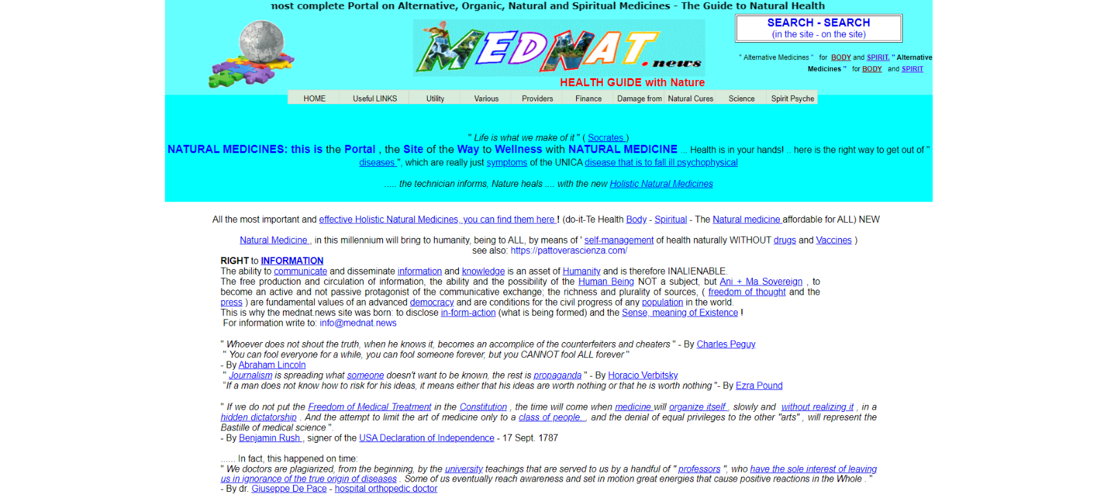
Honestly, I had no idea who Mednat is and what they offer until I saw the retro style writing moving across the screen telling me they provide advice on alternative medicine. Nothing is right about this site, and if you’re sensitive to bright colours, then get your shades ready. The colourful blue header causes a headache – which is kind of ironic for a health website.
Streams of content fill the page, and it’s impossible to take in any of the information. Overall, Mednat completely misses the point, and instead of writing useful content, they’ve filled their pages with links to Wikipedia and quotes.
The Takeaway: Content is king, so take the time to write your own and sell your business.
Cloud 9 Walkers

Cloud 9 Walkers decided on a cloud theme for their website. Had they used the photo as a header instead of a background, it might have worked. Instead, the whole website is full of clouds – and horses.
The business is something to do with horses, but at first sight, that’s all I know. Maybe you can learn to ride; perhaps they’re just selling their selection of horses – it isn’t clear. The funny thing is, once I concentrated on the content, it explained that the company sells horses.
The poor design completely distracted me, and I’m guessing that most people viewing the website click off before they even know what the company offers.
The Takeaway: Don’t drown your content in headache-inducing backgrounds. Please keep it simple!
Best Electronics

Yet another website that does nothing to promote its services, I honestly can’t even summarise how awful the design is. Streams of useless content fill the pages, but there’s no structure.
Best Electronics reminds me of a poorly written word document that nobody wants to read. Apparently, they sell Atari based products, but all I can think of when I look at this site is it’s a scam. There isn’t much else to say about Best Electronics, except why. Why would they? Why did they? You get the point.
The Takeaway: Plan your content and make sure it has a structure.
Alpha1teclabs
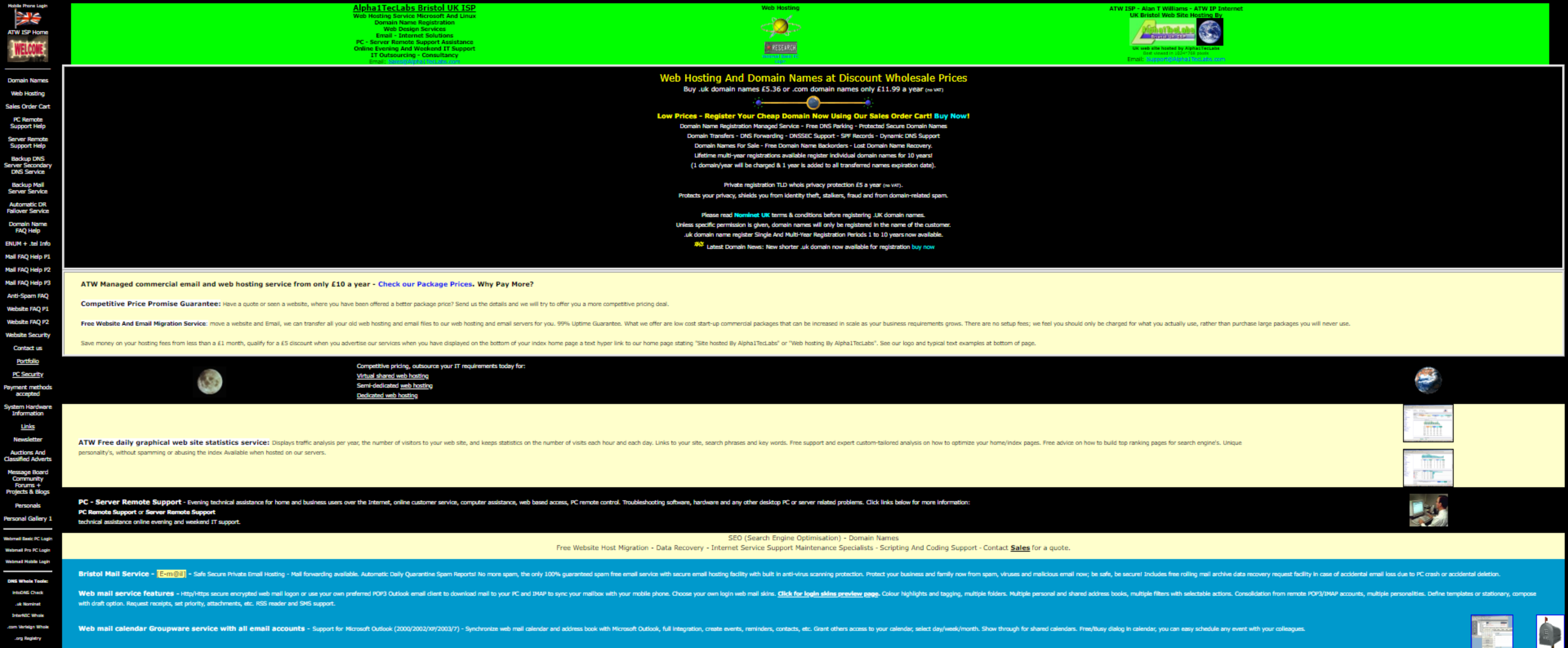
You’d think a technical IT support company would want to showcase their skills, but Alpha1teclabs seem more interested in creating an eyesore. Would anyone trust them with their IT needs? I hope not.
The bright green header, black background, and yellow writing doesn’t just look unprofessional; it does nothing to convey what the company offers. Yet again, we’re met with useless streams of content, and you have to concentrate on seeing their services.
It only gets worse as you scroll down the very long page. The colour scheme changes to white and bright blue, which makes me wonder if the designer let their child loose on this site.
The Takeaway: Choose a colour scheme and stick with it!
Dokimos

Dokimos opens with the message “Accept Jesus”, but their website seems to pay homage to Joseph and his technicolour dream coat. I couldn’t resist exploring this site, but after clicking on most of the links, I’m still not sure what its purpose is.
Basically, it’s asking you to pray and tells you that Jesus forgives everyone. Let’s hope he can forgive the designer for this car crash of a website.
The Takeaway: Let people know who you are and what you’re about. Seriously.
Peters Buss
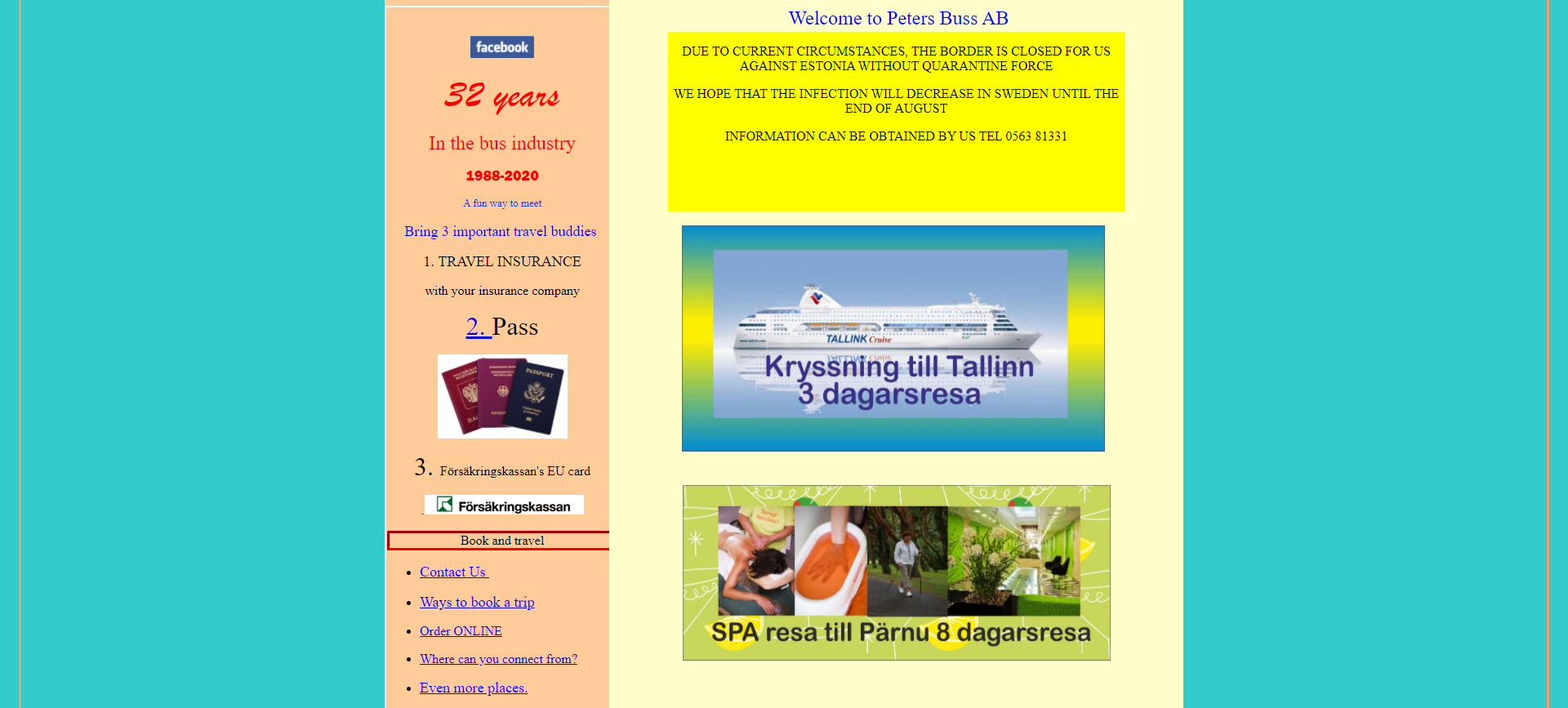
Who are you Peters Buss, and what do you offer?! The website says they have 32 years in the bus industry, but their homepage features a photo of a cruise ship. Then, as you scroll down, there’s an advertisement for a spa. So, erm, yeah.
Honestly, I have no idea who these people are, and I don’t want to know. They do have a very amusing section to explain why nobody ever answers the phone, and all that does to me is say “This is a scam. Back off now!”
The Takeaway: Nobody wants to have to decipher what a company offers. Make it clear – and answer your phone!
Pacific Northwest X-Ray Inc
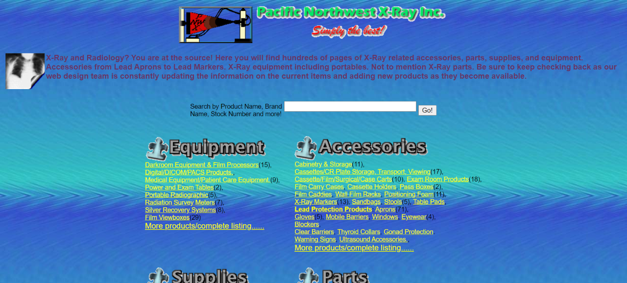
Pacific Northwest decided to take us back to the 1980s with this website, but it will fill you with horror instead of fond nostalgia. Apparently, they have a web design team that continually updates the page, and I can’t help but wonder where they found this team.
Overall, the retro graphics and blue background do nothing for the site, and I had no idea typography like that still exists. The headings remind me of retro WordArt, and the whole thing is a time travel excursion nobody would want to go on.
The Takeaway: Retro looks can work sometimes, but go for modern integration features.
Arngren
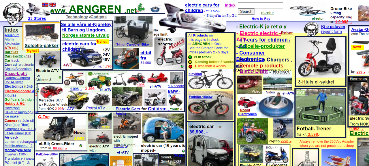
Arngren decided to take a proactive approach to advertise their products by putting them all on the same page. If it’s meant to be for convenience, then it doesn’t work. Instead, the whole website comes across as a 90s style classifieds advert.
The typography is way too small, and there’s so much to look at, it’s impossible to concentrate. Is the business selling products themselves, or are they operating as a classifieds site? I have no idea.
The Takeaway: Don’t try to save space by stuffing everything onto one page. Especially when it means nobody can see the products.
What Makes a Good Website?
Now you’ve seen ten awful website designs, let’s look at what makes a good website. It’s not rocket science, and as long as you incorporate the following features, you’re on the right track.
Responsivity
In today’s mobile-driven society, your website must have full responsivity. These statistics from Tech Jury show how many people use their mobile to access the internet, and if your website lacks mobile responsibility, you’ll lose potential sales.
The Layout
People don’t want to spend their time searching a website for answers. If your website has poor navigation, customers will go elsewhere. Make sure you have a clear menu and plenty of buttons to direct your visitors.
Design Elements
Colours and typography are crucial because they have a psychological impact. It’s a fact that bright colours are eye-catching, but they can also make a website seem unprofessional.
Think about your business and choose a consistent colour scheme. Colour wheels can help you see which shades complement each other, and most people respond best to a simplistic theme.
The fonts you choose can also impact the credibility of your website. As we saw with some of the websites above, the 80s should stay where it belongs; a fond memory to look back on.
A lot of businesses feel they need to stand out, so they go for crazy fonts. Remember, your website is a company platform, so your main aim should be to show visitors that you operate a reputable service.
Content
Content is king, queen and everything in-between. You could have a stunning website design, but if there’s no message, people won’t care. You must show people what you do and tell them how you can solve their problems.
Great content inspires people to take action, so displaying streams of useless information is counter-productive. Your main goal should be to move people along your sales funnel, so give them clear communication and a set of instructions that end up on the checkout page.
Do You Need a Responsive Website?
Now you’ve seen some of the worst websites around; it’s time to think about what you want your website to achieve. Whether it’s to display your services or sell products, responsivity is critical.
At Zapp Sites, we build stunning websites and customise them to your requirements. We’re different from DIY website builders and the typical agency because you have full control over your build, without having to lift a finger.
Our convenient packages include one-off payments or monthly instalments, so you can find the right option to suit your budget. Click here to see our range of templates, or contact us to build your site the convenient way.



Recent Comments